PARALLELS DOCUMENTATION
The purpose behind this research is to answer the question, What are the significant parallels between an artist in the Renaissance and a modern-day designer?
Throughout my four years studying design at York University and Sheridan College, I have always thought about the predecessors of the field. I’ve learned about the titans of the industry, and the eras it has been through, movements, popularities, all things design. I wanted to research further. I wanted to dive into the history of creation. I understand that there were huge amounts of creations before the Renaissance, but by influence of personal interest and my general knowledge before taking on this project, I knew this was the right era for me to focus on.
I began to search for information regarding this past time period, as well as some information from the modern-day and my own knowledge I have garnered as a designer. The question I set out to answer was pretty general, and there are a ton of examples that can prove similarities in various ways. I knew that I should divide this topic into three sub-topics. These sub-topics were; Education, Innovation, and Thinking. I spent from October to the end of December just researching the topics and gathering information that could be split into my sub-topics. I sifted through my list of potential examples and chose the nine that I would proceed with and divide into their groups of 3 for each section. To prove my point even further, that there are many similarities between the two, I want to mention that there was no shortage of examples when doing my research. Hypothetically, I could’ve picked different themes and still would have had extra samples to work with, the Renaissance has an abundance of rich, detailed artwork packed with history. A lot of my information came from the ‘Autobiography of Benvenuto Cellini’, which was a previous read I have done and sort of set the motion for this project for me. A lot of this knowledge came from books, online resources and previous knowledge I have, all of which have been properly credited previously.
The design deliverables were planned out since January. I planned and executed 9 flyers, one digital poster, and a final website. My target demographic determined where my deliverables would be present. I wanted to target designers and artists from a younger generation, so univserity and college would be the best place for this, specifically the design or art buildings. By handing out flyers, and displaying a digital poster in this location, I can achieve my main goal with this project. As I mentioned previously, I wanted to inspire the appreciation for Renaissance artists, as well as connect their lives to our modern-day journeys. A young artist or designer on their way to or from class is already in a mode to take information in, so by placing my deliverables within their path, I’m reaching them at a peak moment, the best time to earn their interest.
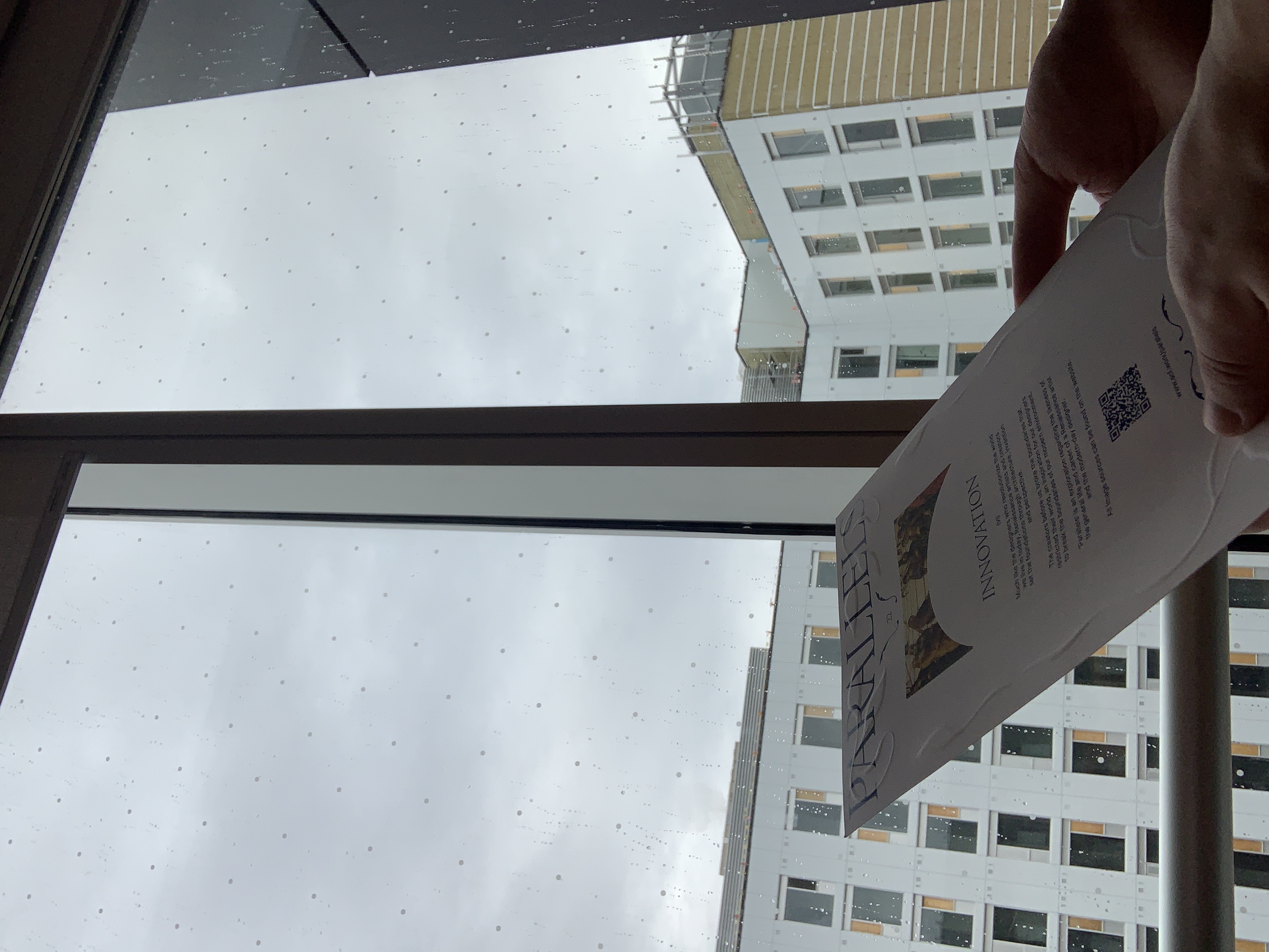
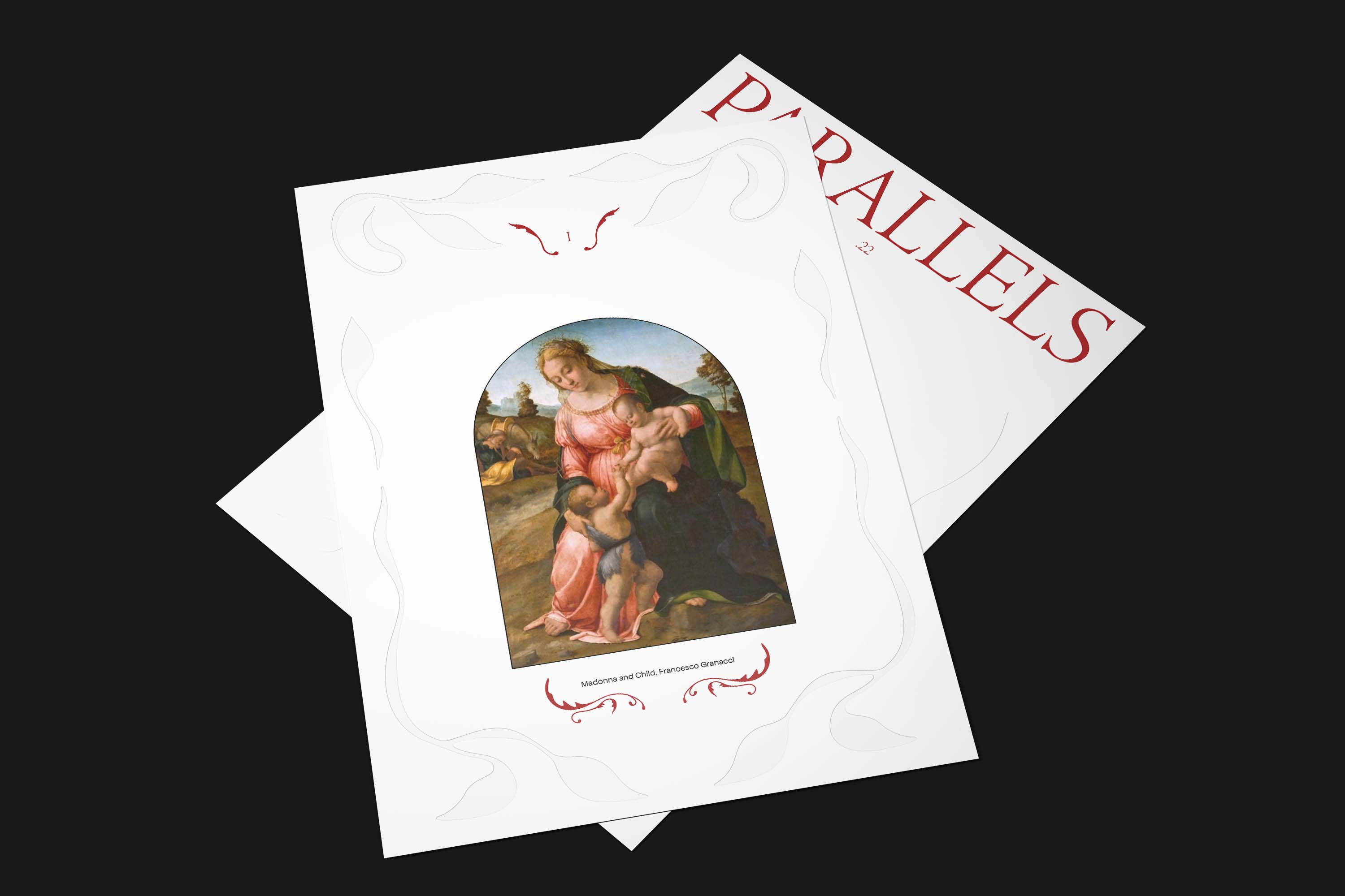
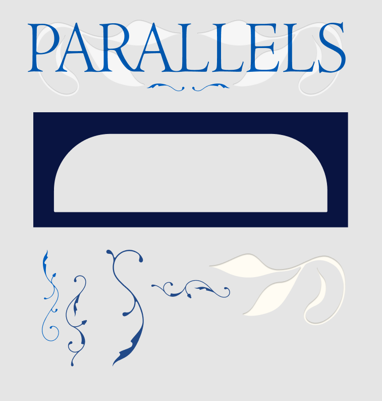
The purpose of the flyers were to give the viewer some background information and most importantly attract them to the main focus, the website. Each flyer has its respective example as the main focus on one side, and information on the other. These flyers work well together and separate, which was a priority for me. They were made to either be displayed on a plastic stand, or handed out in a blue velvet folder which is a recurring theme in this project. On the topic of recurring themes, I made sure to have consistent design elements throughout my deliverables. These elements include; typography, patterns, arches, and colours. These elements all either have ties to the Renaissance world, or modern-day, as it was a priority for me to mesh the two together considering that was the main idea of the project, examples listed below.
Typography: A stretched Jenson typeface with custom ligatures and Inter.
Patterns: Researched common patterns displayed in Italian Renaissance artworks, same with the arches.
Colour: Velvet and ultramarine were used throughout which represents the use of these colours during this time period.
Card Holder: The shape of the holder represents popular column style used in the Renaissance.
These elements were used in the construction of the digital poster as well. The purpose of this poster is to be the gateway to the whole project. This digital poster would likely be the first thing the viewer sees. After taking in the posters information, the viewer is either guided straight to the website, or further convinced by the flyers. The poster features some of the artworks displayed on the website, as well as design elements. The video on the poster plays for about 15 seconds to retain the viewers attention, but has intervals of new artwork appearing to remain interesting. The most important information for the viewer is the title ‘Parallels’ which is strategically placed in the center, and is surrounded by visual elements that subtly guide the eyes to it, making it the main focus. It also features a QR code to begin the journey.
The website is the main attraction to the whole project, a hub of the information. The main goal of mine is to get everyone to the website to educate themselves on the manner. Once again I used the same visual elements for my website as I did for the other deliverables, so nothing new visually. But a ton of information can be found here, it really is the whole project wrapped into one. It features all of the examples, all of the artworks, the source, and meaning behind the whole thing is found here. I emphasize calling it an experience because by scrolling through I feel as if you really do experience a brand new intake of information that can change the way anyone can think of their designs, their art, or the things that make up the everyday environment around them. I want this website to inspire rethinking for anyone who views the page, that is what I believe makes it a success.
Lastly, I want to restate why I found this particular topic so important. I believe as modern-day designers, it is completely necessary for us to achknowledge those who came before us. Creators like Da Vinci, Cellini and more have all done so much for the industry we strive to succeed in. I have noticed throughout my schooling and self analysis, that this information isn’t on display as much as it should be. Of course everyone hears these names and has somewhat of an idea as to what they have done, but the credit seems to slow down a bit after they are mentioned in the art or architecture world. Many people have no idea about their real contributions unless they are at a specialty school or do the research on their own. This project quite literally outlines the PARALLELS between the two worlds. It also does a great job of proving that, they aren’t so different from us at all. Of course so many things have changed even just technologically over the years, but the general life of a Renaissance artist is eerily similar to that of a modern-day designer. They have done amazing things, but so did we. I am so inspired by these artists, and although I may not live up to their success, I can still appreciate their lifepath, and I want other designers to as well.
Below I will include some process photos and other information of how I came to my final result. I learned so much throughout my journey creating this project. I used new methods, learned about new tools, and took in so much new information about the topic and design in itself.
Process Work
Pencil sketch pattern exploration
Initial concept mockups and colour exploration
Testing embossing methods and praying I don’t ruin my
only copies of the posters
Gathering all of my Elements for the
poster and website
Learning Readymag for website building